 PDF to Word
 PDF to Excel
 PDF to HTML
 PDF to Text
 PDF to PDF/A
 PDF to PowerPoint
 PDF to JPG
 HEIC to JPG
 PDF to PNG
 OCR Converter
 Word to PDF
 JPG to PDF
 Excel to PDF
 PDF Converter
 PNG to PDF
 PowerPoint to PDF
 DICOM to PDF
 Merge PDF
 Split PDF
 Delete Pages
 Rotate PDF
 Rearrange PDF
 PDF Editor
 Crop PDF
 DOCX Editor
 Edit PDF Text
 Compress PDF
 Sign PDF
 Redact PDF
 Fill in PDF Forms
 Flatten PDF
 Annotate PDF
 ASK PDF
 PDF Compare
 PDF Viewer
 Office Viewer
 Text Compare
 Validate PDF/A
Here are 4 Types of Excel Charts to Use in your Virtual Classroom
Jul 25 2023
Productivity

5.5 min
Share this post
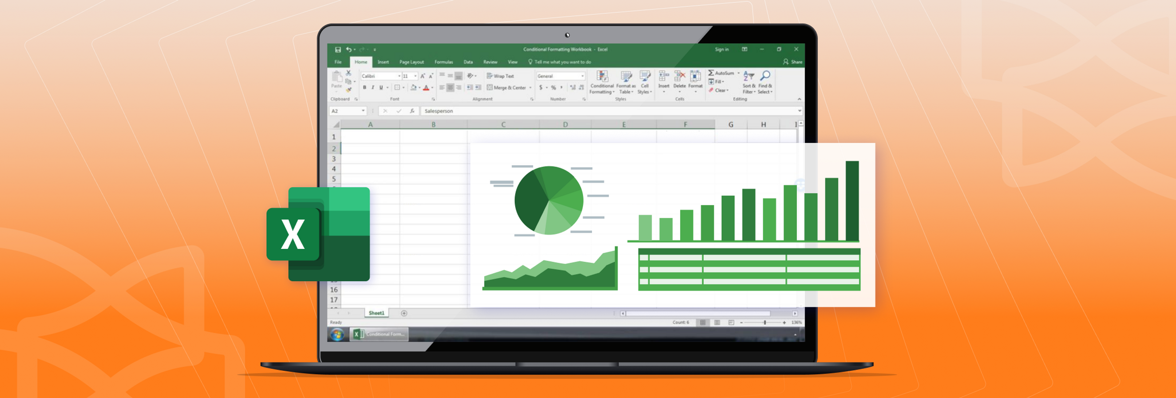
Although there are many educational tools out there, Microsoft Office is still a staple in the classroom.
Excel charts, for instance, can provide a visual impact, making it easier for students to remember lesson material, especially when you’re teaching a class virtually.
Looking for ideas? We cover a few different types of charts you can create in Excel to help you with your lessons online.
How teachers can use different charts in the classroom
Below are some basic charts in Excel that you can use creatively in your virtual lessons. You can also check out all the available chart types in Office if you’re looking for something different.
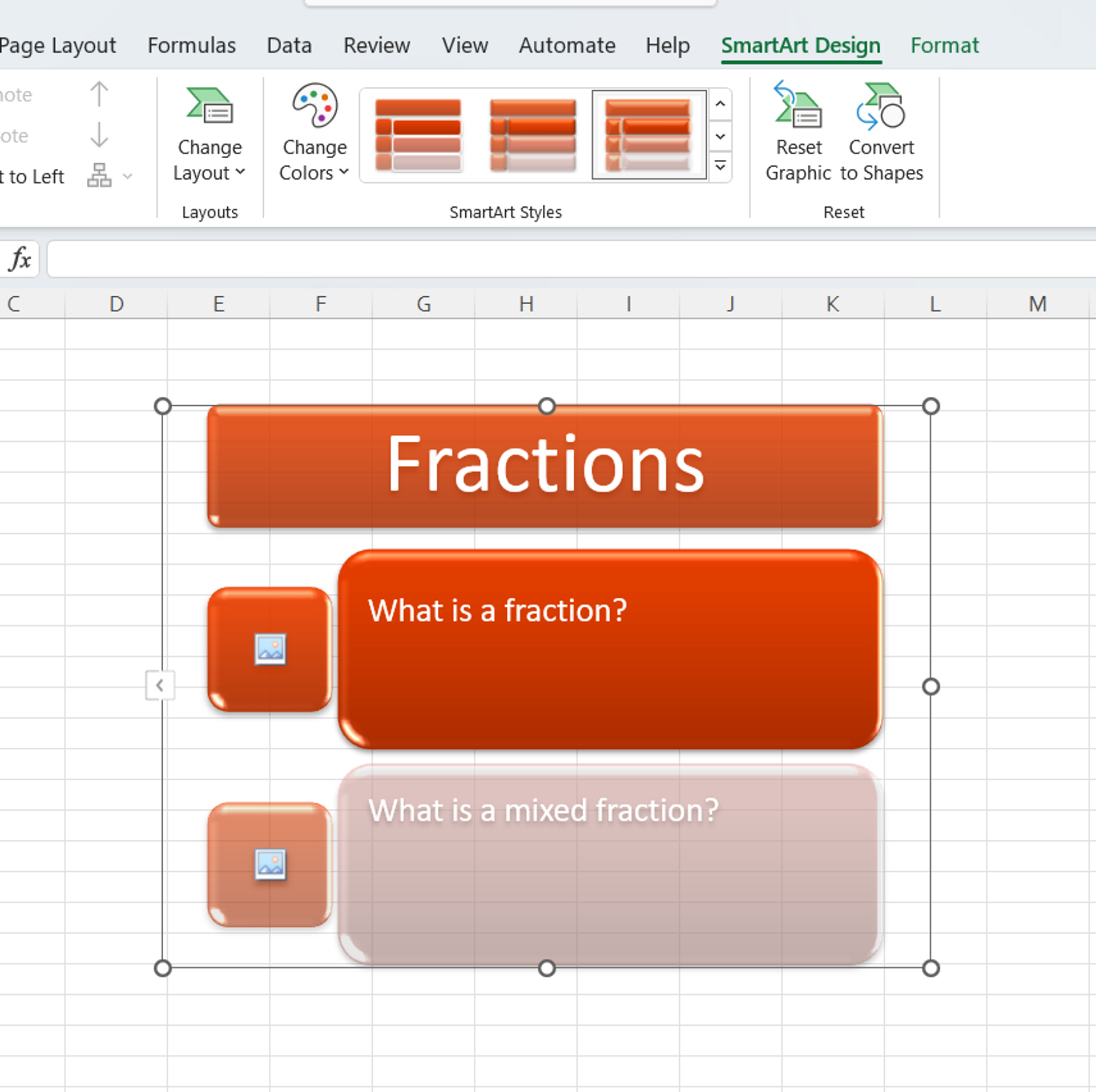
What is an anchor chart?
Anchor charts are a powerful learning tool that helps teachers keep track of the lesson and help students remember the most important things on a certain topic.
They’re usually printed out and displayed in the classroom for future revision. However, a digital SmartArt version in Excel can be just as or even more effective as students can save it as a reference sheet for when studying offline outside of class hours.

How to use an anchor chart in the class
Because anchor charts are usually general when it comes to formatting and content, they can be used for any purpose. Somethings you can try:
- Listing the goals of a project
- Outlining how to research topics for an assignment
- Creating a source of main points in subject material
- Bridge gaps and connections between old and new information
When covering a major subject or topic, you can use an anchor chart to help students keep facts straight, cover researching tips, list division or multiplication rules, or outline the steps to writing an essay. The possibilities are endless and can save time spent going over main concepts again.
You can use Excel to easily organize and visualize your chart with the simple formatting tools available. Use Excel to insert images, Smart Art, text boxes, and tables as needed.
What is a bar graph and column chart?
Bar charts and column charts are one of the most common graphs you see when values are compared to one another. Both are essentially the same, but the categories appear horizontally in bar charts rather than vertically.
How to use bar and column charts in your lessons
Because Excel lets you turn raw data into graphs, these kinds of chart types can make it easier for students working online to interpret that data. They can help students analyze cause and effect between values, understand relationships between values, and encourage conceptual thinking in a remote learning environment.


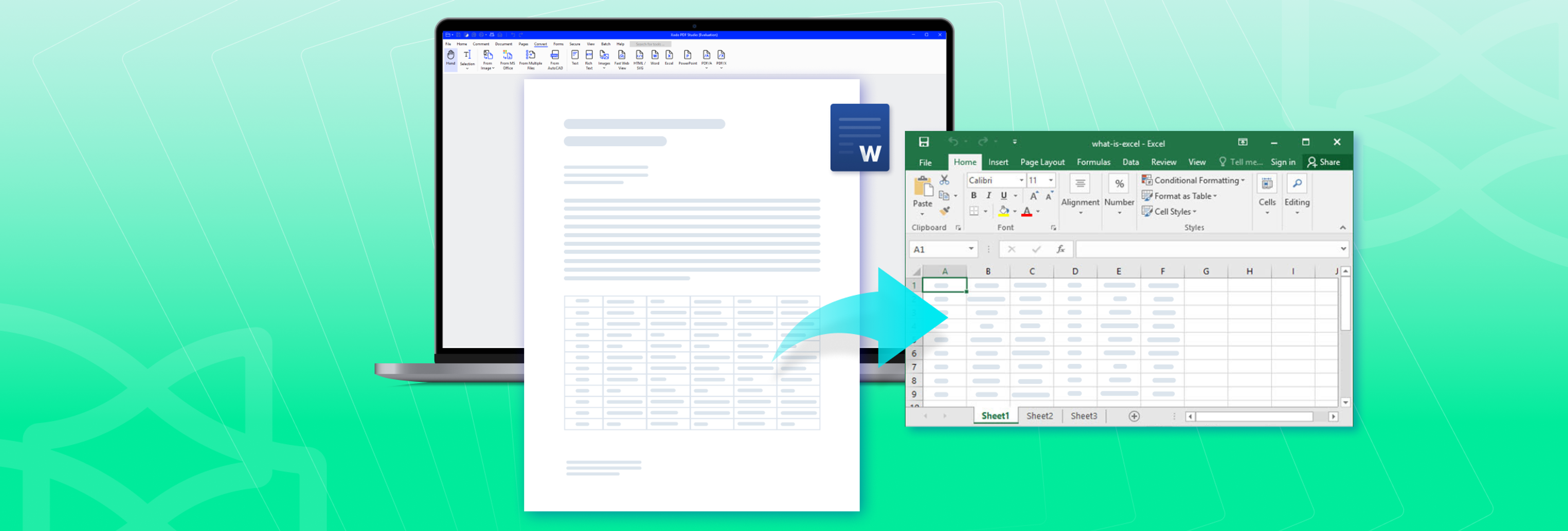
Excel can also be a great way to showcase any online research you do for lessons. For information you find in PDFs, a simple PDF to Excel conversion will do the trick. Adding that data to a bar graph or column chart is a quick way to include in-depth details to your lesson plan in a way students can understand.
How to create a bar or column chart
Inserting a bar graph or column chart in Excel is straightforward. In Excel, select your data and use the Insert menu to select a bar or column chart in the options provided. Once you select the one you want, Excel will automatically pull in and format your data.
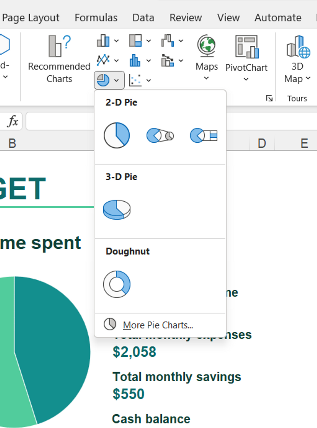
What are Pie Charts?
Pie charts are one of the most popular types of charts to use because of their visual nature. They're great at visually breaking down total amounts into smaller parts. Applying this kind of visual to different topics can be very effective.

How to use a pie chart in class
Some advantages of using pie charts in lessons:
- Colourful and easy to understand
- Easy tools for visualizing and discussing statistics
- Useful when teaching math, finance, and fractions
If you’re using this type of chart, you can set up a dynamic pie chart and illustrate real-time changes when a value or variable changes.
Another idea? Include pie charts side by side to illustrate any findings, statistics, or different perspectives on the topic at hand.
Or, if students are working on a project in a group, have each one responsible for researching one portion of the project and report and include each of their quantitative findings in a pie chart.
How to make pie charts in Excel
You can create a pie chart in Excel by first selecting your data and then inserting the Pie Chart you want. If you need some tips on creating or troubleshooting as you go, Microsoft’s resource, Beyond pie charts tutorial, can offer some pointers.
What is a Flow Chart?
A low chart is an explanatory type of chart that displays and outlines the steps that occur in a process. These types of charts are great at laying out and visualizing individual components.

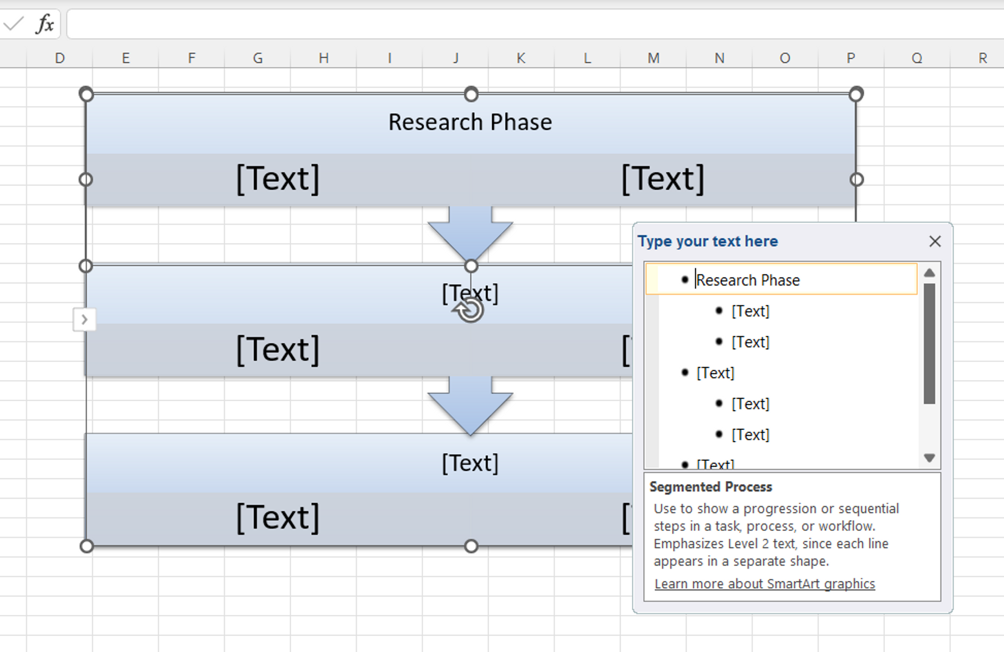
You can use them to further explain complex processes in physics, biology, and history – any type of process where one component is connected to another. Moreover, a flow chart can translate better in virtual classrooms where students need to grasp processes and study on their own.
How to use a flow chart in lessons
Flow charts can help improve students’ organization skills and understanding the relationship between different steps in a process, such as:
- How a law or bill is created
- Illustrate the states of matter in science lessons
- How to perform mathematical calculations like long division or advanced multiplication
- Basic social skills and interaction
If you’re using a flow chart, you can easily test students’ understanding by leaving some of the steps blank. You can then have the students fill in the blanks to see if they’ve understood the lesson.
How to make flow charts
In Excel, you’ll have several options to customize your chart. You can create a flow chart with SmartArt and choose from different shapes, colours, layouts and flowchart symbols.
Use Xodo tools for remote teaching
With remote learning and communication as the growing trend, you can present your Excel chart online in Xodo’s free Office Document Reader which allows you to edit, crop, and annotate your documents in real-time for your students to see.
Other free online Xodo tools give teachers the flexibility to not only convert and view your documents, but also prep and customize any digital document content you need to teach your lesson.
From editing and cropping to merging and annotating PDF content, you get a wide range of free PDF tools for education that allow you to assemble handouts, reuse PDF images, or help organize your teaching material saved all in one secure place.
Try Xodo to see how our 30+ online tools can help take your lesson planning to the next level!


Related Articles

Teaching with Technology - Top PDF Tools for Teachers
Xodo is the ultimate PDF suite of tools for teachers and students. Unlock advanced features like annotation, forms, digital signatures and more to boost student engagement and drive learning results. Check out our post as we show you how!
How to Convert Word to Excel
Need to analyze tabular data in MS Word? Discover how to convert Word to Excel with Xodo PDF Studio. Our guide shows you how to quickly transform static Word tables into dynamic Excel spreadsheets.

Glossary of File Formats Explained
Not sure which file format to use—or why it matters? This detailed glossary guide breaks down the most common types of text, audio, image, video formats and more, how to choose the right one, and answers to your most common questions.


